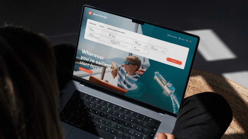
New branding project. To most of their 2.5 million customers, Direct Ferries’ website is their brand. But it’s also got a transactional job to do and the UX needs to be super-clear. We had to find a balance between the bigger picture – Direct Ferries’ brand overall – and the important details: nothing should get in the way of making a booking.
You know Expedia. You know Booking.com. How about Direct Ferries…? Exactly. If you’re one of the 2.5 million people who books ferry tickets with Direct Ferries, you’ve even spent time – and money – on their website. But because a Google ad sent you there, you just don’t know the Direct Ferries name and brand.
You will now.
This was an out-and-out branding job for us. Can we get people to notice – and return to – Direct Ferries and rebrand ferry travel as more desirable at the same time? And can we create a brand for a travel aggregator that ticks the best-in-class boxes (simple, clean, easy to navigate, and don’t mess with the UX!) but is more than transactional?
We really like doing branding jobs and we come at brand strategy differently to both design agencies (visual, mood boardy) and brand consultants (top level, positioning statement-y). Words force you to sharpen your ideas up from the get-go. And when you’re super-clear about what you want a brand to do and get across, it’s easier for designers to understand the brief and work with it. We came up with the brand strategy and ideas first, then brought NotOnSunday on board (pun absolutely intended) to do the design.
The lead line and tone of voice pitch Direct Ferries as THE go-to brand for booking ferries all over the world. On top of that, we’re giving ferry travel itself a makeover. The word ‘Sailing’ and editorial photography are all ways to change how we all think about ferries.We wanted to create a system that was easy to manage. This one uses a mix of chevrons (in the shape of a ship’s bow, ferry fans) and headline couplets inspired by the brand’s lead line. Direct Ferries’ in-house team can mix and match them in different ways.Direct Ferries’ business model is about volume. They need to sell hundreds of thousands of tickets every month, so the system we created had to work hard with tactical ads and offers.We were not-so-secretly making ferry travel more cosmopolitan at the same time…And appealing to all ages and travellers……wherever they’re heading.We worked with Direct Ferries’ translation agency to make sure the system works in all languages.Including languages with less snappy grammar rules and longer word counts.The brand has to work across mobile and desktop, so that’s where we started. Above all, we wanted to make sure the brand works online, where most people see it (and that it isn’t a brand that just looks pretty on a tote bag).We summed this all up with NotOnSunday in a super-practical toolkit. And then we did follow-on work with Direct Ferries’ teams to get their positioning and values shipshape too.